Toyo Ito is one of the most important Japanese architects of our time, and in my opinion, he should be a Pritzker Prize laureate. Some of his more renown works include the Sendai Mediateque and the Za Koenji Theatre in Tokyo.
After his successful participation in the Serpentine Gallery in London, Toyo Ito began experimenting with the concepts used in its pavilion for designing two well-known department stores in Ginza and Omotesando, the two most important business districts in Tokyo. This entry will be dedicated to Tod's Omotesando (2002-04) as I previously had featured Mikimoto Ginza 2.
"Trees are organisms that stand by themselves, so their shape is a inherent, structural rationality."
LOCATION
Very close to Omotesando Hills by Tadao Ando, Toyo Ito designed a store for the Italian footwear chain Tod.
It is located on difficult L-shaped terrain plot, with a facade of just 10 meters facing the Omotesando boulevard. Here, Ito proposed a 7-level building and a basement, whose image is completely different from that of the other buildings around: a fractal structure somewhat reminiscent of the convoluted image of the Beijing Stadium by Herzog and DeMouron .
It is located on difficult L-shaped terrain plot, with a facade of just 10 meters facing the Omotesando boulevard. Here, Ito proposed a 7-level building and a basement, whose image is completely different from that of the other buildings around: a fractal structure somewhat reminiscent of the convoluted image of the Beijing Stadium by Herzog and DeMouron .

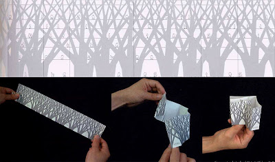
Inspired by the Omotesando grove and the complicated geometry of its branches and trunks, the logic of its structure is based on the representation of 9 trees, whose silhouette folds along the perimeter of L-shape to form the facade of the building. Following the structural logic of botany, the columns are wider at the base of the building and become more slender as they gain altitude, and also branch off in a larger number of structural elements.
The idea is presented to the outside clean, naked, without fuss or details, just with the clarity of the structure as the only ornament.

As in the Sendai Mediatheque, the organic weave emphasizes the verticality of the columns of the building, while enhancing a sense of lightness.

It is amazing to see the edge of the box, where it usually go one column, pierced by a corner window, making the building look much lighter.


Thus, as in the case of the Mikimoto Ginza 2 the entire building is supported by a external structure, leaving the interior free of columns, which allows the company maximum flexibility to store and display their products.


The structure becomes both the enclosure and the wrapping expressive facade. For its construction, 30 cm thick concrete slabs were used, which support the whole load of the building.

In the more than 250 openings that resulted from the composition, Ito alternated transparent, translucent or opaque windows that allow varying degrees of light and privacy, generating a dramatic, scenic effect. As expected, Ito favored the exposure of the building towards the main streets and makes it more private to the lot next door.

The store includes the first 3 levels and the basement, while the private offices and the social areas are located in the 3 upper levels. Level 7 is a terrace.

The circulation to the offices of the top is differentiated and more sober than the one in the commercial areas. Therefore, in the first floor the stairs are located at the back, inviting people to walk along the store. From the second level Ito adds another set of stairs at the other end in order to facilitate the movement of customers.

SEE ALSO
- OTHER WORKS BY TOYO ITO
- SHOPS AND COMMERCIAL FACILITIES.


Best post,Thank you.
ReplyDeletelook here
Best Astrologer in Davangere