TIME'S I (1983-84)
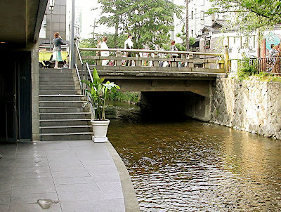
The Takase River is a small canal that runs parallel to the Kamo River in Kyoto. In the seventeenth-century flat boats called takasebune (literally "boats of Takase") used to transport different types of cargo, from goods to prisoners, but today is just a placid stream flowing over paved stone and shaded by a grove. However, in the 80's this channel and the Kamo River were contaminated, carrying colored chemicals from the factories upstream that dyed kimonos.

Near the Sanjokobashi bridge in downtown Kyoto there was a building whose owner wanted to remodel. He hired Tadao Ando, but the architect did not agree much with the client's ideas.

The client wanted to organize the building making the most out of the area, creating a high density and crowded retail store. The architect understood benefit as a synonymous of a spatially attractive and worth to visit building, providing it with plazas and open areas.
 One of the interior micro-squares, in addition to providing light, they offer an interesting spatial experience.
 The client wanted the building to face Sanjo street, one of the most commercial roads of the city. The architect wanted the building to face the river.


The client was afraid that his merchandise would be flooded over due the proximity to the river. But the architect wanted the building to look like a boat, as takasebune. Ando has a reputation for being stubborn and got away with it.
 Historical photograph of the Times I, before building the Times II. Integration with the river is remarkable, as if it were a boat.
Today the customer lives happy and grateful, his building is commercially successful and well attended. It is also one of the most remarkable commercial buildings have seen, despite its modest proportions (or perhaps because of them).

 The scale of the project is small and its materials are sober. But it is his philosophy and spatial sequencethat makes it so special.
 As for Kyoto, the city is grateful to Ando, since this building helped to awake environmental awareness to clean up the stream.
 This building is half-submerged in the level of the street, which is almost at the same level with the river. Here, the architect has a privileged the location of a small terrace.
 Photo courtesy of Silvia Liu
The building is a small 3-story block, topped with a metal dome which accentuates its longitudinal direction.


The corridors along the side facing the river collect the pedestrian flow of the street and invite people to visit the different levels of the building. It is possible, in the midst of a shopping day, to stop for a while and overlook the flowing stream Takase.
Inside, the circulation is organized within the orthogonal geometry of the building , weaving and making the visit a kinetic experience. Ando creates concrete walls and folds them as if they were a giant origami. Along the way, through courtyards, bridges, balconies and high ceilings, he generates sensations of surprise, intimacy, drama, at times entering a labyrinth that inevitably leads to the framed view of the river, as if it were a living painting.
TIME'S II (1986-91)
Once the Time's was finished, Tadao Ando began to focus on the neighboring building, which housed a Chinese restaurant. Ando went to the owner proposing the renovation of his building. The owner not only rejected the idea but even got angry with the architect. But as I said, Ando is stubborn and, as a good ex-boxer, he was not frightened at the first hit. He insisted, and insisted for 4 years. Until finally he got the commission for the Time's II.

Ando's main challenge was how to integrate these two buildings in a single commercial space, since they belonged to different owners (and even competitors). Volumetric integration was achieved by the similarity of heights and materials, openings and textures.

He worked here on the basis of a square plan, a 3-story volume, although the last level is double-heighted. But since this plot was smaller, Ando wanted to emphasize its verticality, topping it with a flattened metal dome instead of a vault.

Notice how the architect uses the horizontal lines of the pre-existing Time's I building's to integrate the new building's volume of the tower, although the heights of both buildings are different.


Access to the Time's II is made through a small corridor at the back of the neighboring plot, which is located in the opposite corner. Both buildings are interconnected through corridors and bridges, greatly enriching the circulation, and spatially, through courtyards, multiple heights, changes of scale, spaces that suddenly narrow and widen, which are hidden and suddenly open, etc. As in Times I, the river is always a visual and sonic appeal into the composition.

The effect of light and shadow is superb. It is like sometimes the walls were made ethereal, as if they lose their materiality due to the range of shadows and tones of light, transforming the circulation into a rich abstract experience.

Time'S III?
Not yet. Although Ando already have schemes to reshape the neighboring plot and thus complete the whole block with his Time's. But it seems that the architect has not yet managed to convince the owner.

I recently received a comment saying, rightly, that we should not mystify great architects. In the case of Tadao Ando, he is known for his preference for form over function. For example, in his famous Church of Light , he planned the cross without any glass, only a gap of pure light. But what about the rain, cold and wind?
In the Times, there is a pleasant terrace by the river, above which a bridge is supposed to protect it from the natural elements. In order to maintain the independence of the formal syntax, the bridge is separated from the plane of the wall. Well, when it rains, water seeps all around, so you have to sit with umbrella. Maybe Ando did not know that this area was to be used as an expansion of a restaurant.

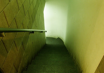
However, what is worse is that the entire building has a single public toilet hidden behind a series of underground labyrinths.

Yet I will not deny that this is one of my favorite buildings, not only for its extraordinary use of space, simple elements and materials; but also for the personal memories that this building evokes. Memories of camaraderie, friendship, romance and celebration. And to be honest, also memories of blood and extreme stupidity (like that time during the cherry blossom season, when I wanted to take a picture of the Time's from a "never before seen" angle and walked barefoot in the Takase river. As a result, I injured my foot and walked lame for about a month. The saddest part is that "the glorious photo" was lost forever in a hard disk crash. Now you can see, dear reader, how sacrificed the life of a blogger is).
SEE ALSO
- OTHER WORKS BY TADAO ANDO


Hi,thank you very much for the introduction of this building.I am a architecture student from China and Tadao Ando is my favorate architect!
ReplyDeleteI am doing some study about his works recently and I do need the plans and sections of this building.(3D models would also be great).Do you have some and can you send them to me?You put a plan in the post but the size is kind of small.
I would be very grateful if you can help me!My e-mail adress is stuka04@gmail.com
Tank you so much!
I'm glad I found this web site. I couldn't find any knowledge on this matter prior to.Also operate a site and if you are ever interested in doing some visitor writing for me if possible feel free to let me know. im always look for people to check out my web site.
ReplyDeleteArchitect In Karachi
Enyone know about uno house ?!!
ReplyDelete