Showing posts with label library. Show all posts

Tuesday, July 9, 2013

SURREY CENTRAL LIBRARY, CANADA.


In recent times libraries are no longer conceived as simple facilities for storing books but they also fulfill a social role, enhancing the community relations. Such is the case of the Peckham Library in London , the Sendai Mediatheque by Toyo Ito and the Seattle Central Library, a project by OMA. In this post we will discuss some features of the new Surrey Library, designed as a space for research and as well as for social interaction.


Surrey is the second largest city in the Metro Vancouver conglomerate. With its 460,000 inhabitants, it has been long overdue in its economic development. However, this situation is trying to be reversed through the development of mega-projects that seek to revitalize the downtown area as well as improve the quality of life of its inhabitants.


The flagship of this development is the new Surrey City Centre Library, designed by Bing Thom Architects, who a decade ago had already carried out another successful project in the vicinity, named Central City, a vibrant mix use facility that combines public space, a university and a shopping center.


The library has an iconic profile and its sloping walls express the dynamism which also characterizes the interior space. Capitalizing on the complicated geometry of the plot, this building of sloping walls, pronounced keel and large bluish windows resembles a ship.

Photo courtesy of eVolo

"The building design evolved out of the need to provide a space for reading, studying, and above all, gathering as a community"


But how to understand a library function nowadays? Given the versatility of today's electronic media, the book as an object is giving up its importance as the core element of the library. By contrast, the books now share their protagonism with their readers, who also establish communication and carry out discussions between them.


For this reason the building includes, aside of  100,000 volumes, several areas for assembly of up to 120 people, a learning center, collective and individual  reading areas, computer classrooms, a  meditation room, a teen room and children's play areas. In addition, the spaces are flexibly organized and they successfully have housed social events for the community.

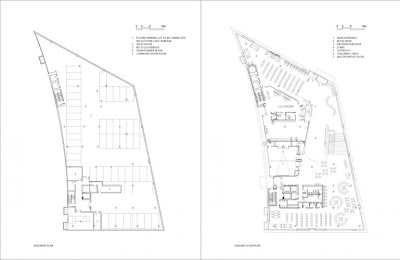
Basement and first level
Second and third level
Fourth level and roof plan.


Sections. Images courtesy of Bing Thom Architects.

This idea has led to conceive the library on the basis of two types of interrelated spaces: the more public areas, which form a large plaza, amphitheater and terraces where the community can socialize and interact; and those more private ones, containing collections of books and more intimate spaces for research and study.


This duality of spaces is further characterized by the type of lighting. The large central courtyard is lit by large windows which establish an open dialogue with the outside. The terraces and parapets incorporate dynamism into space and promote, at the same time, visual integration between the various levels of the library.


A small amphitheater accompanying the stair was finished in simple materials such as exposed concrete and wood. This space brings together the community to medium-sized social activities, or functions  just a place to sit and read together.


Views and detail of the amphitheater, which brings together the community for social activities

This space is crowned by a  trapezoidal skylight. Interestingly, it is not a typical open skylight, but rather a sort of ring around a trapeze, which allows a diffuse control of natural lighting. This detail provides technical and structural challenges, in order to sustain this great trapeze that seems to be floating, surrounded by a transparent aura.


Another challenge was the construction of the walls, which describe a curved path while being inclined outwards, thus expressing dynamism as well as providing shadow outside.


Despite its complexity, a computerized study allowed efficiently calculate the structure. Also, by means of  a special type of concrete a fine finish was achieved, without the need of coating. These features have allowed the library to qualify as LEED "green" building.


The designers involved the community not only as the final users of the building but as actors that participated in the design process, through the use of social networks and collective workshops. The architects have even teamed up with high school students in order to create and discuss some of the furniture inside.


The library is part of a larger urban area that is currently under construction and we hope to share with you in the future when finished.

SEE ALSO 
- LIBRARIES 

Monday, June 17, 2013

KOOLHAAS & OMA: SEATTLE LIBRARY

The Seattle Central Library -designed by Rem Koolhaas and Joshua Prince-Ramus, members of the Dutch Office of Metropolitan Architecture (OMA), in conjunction with the Seattle firm LMN Architects- is certainly one of the most influential public buildings today. Controversial, as many of the works by Koolhaas, it attracts followers and detractors; however, with more than 2 million visitors per year and the huge catalyst effect in the revitalization of the urban environment, no one questions its social success.


Its angular and provocative style and its exposed structure forming a diamond pattern, strongly evoked some of Koolhaas' other works, such as the CCTV building in Beijing or the Casa da Musica in Porto .


BACKGROUND

Andrew Carnegie, the steel magnate who built libraries across the U.S. sponsored in 1906 the construction of the Seattle Carnegie Library, made in neoclassical style in a plot located on the Fourth Avenue.


Over the years it became necessary to have an extension, so that in 1960 a 5-story building was erected in modern international style, designed by Bindon & Wright, replacing the old library. Again, the demand exceeded the capacity of the library, coupled by the scarcity of parking areas and the seismic risk, which determined the need of constructing of a new library in the late 90s.


CONCEPTION


Joshua Prince-Ramus highlights three key ideas in the design of the project:
a) A hyper-rational process of design, in which rational ideas acquire an independent logic and result in images that seem irrational (at first glance the library seems product of a designer's whim rather than an analytical process).
b) A team work in the design process, leaving aside the image of the architect-genius, but an interactive work between several members of the office.


c) Confronting the traditional view of flexibility in modern architecture which, according to him, makes spaces more generic where almost anything can happen within them, but in practice they are filled by the most immediate need, which ends imposing itself to other activities. Instead, he proposed the "compartmentalized flexibility", which identifies a number of places that, even if an activity is prominent, it can be ensured a spectrum of multiple functions.


OMA based its design on the idea that books are the most important source of information that people use in the library, without neglecting many other forms of technology that are available today by the user. But perhaps the most revolutionary aspect was its idea that the library should also meet social roles (something to which librarians were reluctant at first). OMA reorganized the program proposed by them in 5 platforms whose function could be predicted to be stable in the future (administration, books storage, meeting space, information and parking ). On top of each platform four open spaces were located , whose function could become more unstable.


The conceptual model has these two types of spaces defined inside boxes, with open spaces at the top and circulation systems linking the various elements. These boxes are moved in order to make better use of natural light and enjoy views of the city. Since each of these platforms houses different functions, various areas were assigned to them. Note the similarity with the diagram of the program with the actual section of the building.

Subsequently these compartments were covered by a "skin" of glass and metal structure providing shade or light according to the required needs.


This was one of the things that I liked about the library, its visual integration to the surrounding urban landscape and its clear understanding of the interior spaces, that dramatizes the tension between them. Other contemporary libraries, such as the Sendai Mediatheque and the Tama Library , both designed by Toyo Ito in Japan, have also chosen  transparency and a clear integration to the environment.


DESIGN

The building contains 38,300 m2 of built area in 11 stories and a basement parking.

Something that is not very evident in the pictures is that there is a pronounced topographical difference between the 4th and 5th Avenue, which can accommodate two levels.


Especially in the front of the Fourth Avenue can be seen the imposing overhang, 14 m. long, generating a covered plaza, an effect that somehow reminded me of that square generated in front of the Peckham Library in London .


The lowest level, to the southwest, which is accessed from the 4th Avenue, contains an auditorium, a language center and a Children's Center whose decoration aims to "be appreciated by children, although it is not condescending to them" (this allows a 11 years old child  not to feel uncomfortable by sharing the same space with a 5 years old).
The second level corresponds to the administration and it is practically not seen by the public.
The third level, which is reached from the 5th Avenue, is the reception area. Outside, the skin of the facade is anchored to the floor forming a sort of entrance porch.


Upon entering the building we were welcomed by a large square bathed in light, adorned with fountains and gardens, providing a warm refuge from the cold climate in Seattle.


The space becomes a large room where users can enjoy reading in a comfortable chair, sipping a coffee (which is a local favorite... it is not by chance that this city is the birthplace of Starbucks Coffee).


The fourth level contains meeting areas, arranged in more organic spaces which can accommodate up to 200 people.
The fifth floor houses the largest number of public computers, where users can get access to more specific research materials, for which there are several librarians ready to help. Spatially, it is located in the middle of the building, overlooking the square and allowing visual contact with the street and with the upper levels.


From the sixth to the ninth level lies one of the most innovative areas of the building: the spiral of books. Contrary to the classic horizontal library, the shelves are organized in large sloped platforms, which run continuously through ramps (a "cheap parking for books," says Joshua Prince-Ramus). Reading rooms, which for reasons of function have to be horizontal, are placed staggered along the ramps.


The tenth floor, which is the highest level that can be accessed by the public, is the reading area​​. From here stunning views of the city can be enjoyed, particularly to the Elliott Bay. Here is also a small balcony at the end of a corridor which, according to Joshua Prince-Ramus "it was designed it in order to ask my wife to marry me... and she accepted." Actually this small space is a viewpoint to appreciate the spatial richness of the building and its wrapping glass and steel skin. I think the designers created this small balcony just for us architects to enjoy this remarkable space.

Photo courtesy of Katya Palladina

STRUCTURAL DESIGN

The building represented a particular challenge, as the region is prone to earthquakes and strong winds, and the shape of the building has large overhangs that give it a light appearance, but require a special structural design. The structural solution is based on a solid concrete core holding cantilever slabs (a solution also frequently applied in skyscrapers ). This solution allows to minimize the number of columns needed inside the space.


In addition, vertical and inclined columns and trusses were created. The floors that make up the Spiral of Books and Reading Room (6-10 stories) use leaning columns in order to transfer the weight of the upper floors.


Finally, the wrapping diamond shaped grid serves as a structural clamping element. It contains a glass coating which has a thin metal layer that allows transparent views only from the inside.


A external steel grid is superimposed to an aluminum inner grid to hold the glass, both painted light blue. I must say, however, that the finishing is a bit rough.


ART AND DECORATION.

Bright orange stairs, yellow escalators, colored carpets and a light blue grid show Koolhaas' predilection for color.


Additionally, there are works of art such as that of Ann Hamilton, who designed a 670 m2  carved wooden floor containing phrases written in 11 different languages, which suggests a "tactile experience of the book in the digital age".

It is also fun, going down the escalator, to find some  "Talking Egg Heads" called "Braincasts", made by artist Tony Oursler.
Outside, the Tsutakawa fountain, also called "The Power of Wisdom" was sculpted in bronze by noted local artist George Tsutakawa.


****

Despite some criticism due to the way Koolhaas and OMA perceive architecture, different than traditional approaches, it is clear that the library in Seattle is a social success. Our visit occurred during a week day and we found the library was full of people. I was pleased to find users of all ages and social groups (including many homeless who frequent the library on cold days).


SEE ALSO
- LIBRARIES